With the help of ggplot2, creating beautiful charts is an easy task in R. However it can get a little bit tricky when you’re trying to plot a set of data on a single chart, over a shared x axis.
A neat trick is using the library reshape2 which is a very useful data manipulation library for R.
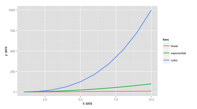
With the help of melt function of this library, we can combine our data into a single data frame in the format that ggplot2 wants from us in order to draw different lines over the same axis.
In this example, in data.csv I have function values of y=x, y=x2 and y=x3 for x values from 1 to 10 and i’m trying to draw these 3 charts on the same axis.
Note: if you haven’t installed ggplot2 and reshape2 make sure to run
1
| |
and
1
| |
1 2 3 4 5 6 7 8 9 10 11 12 | |
You can find the source code here on github